Capital One: Credit Cards
my role
Working with Capital One’s brand team, I was responsible for the user experience, visual design, and interaction design of the entire suite of Capital One’s online product pages for credit cards.
The challenge
The not so good, the bad, and the ugly.
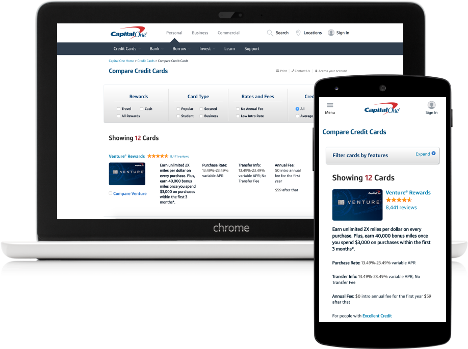
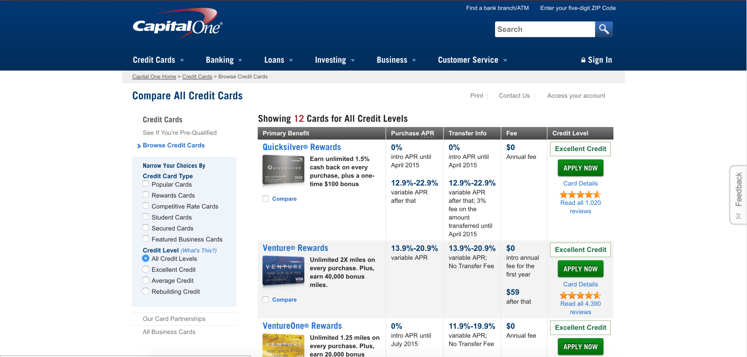
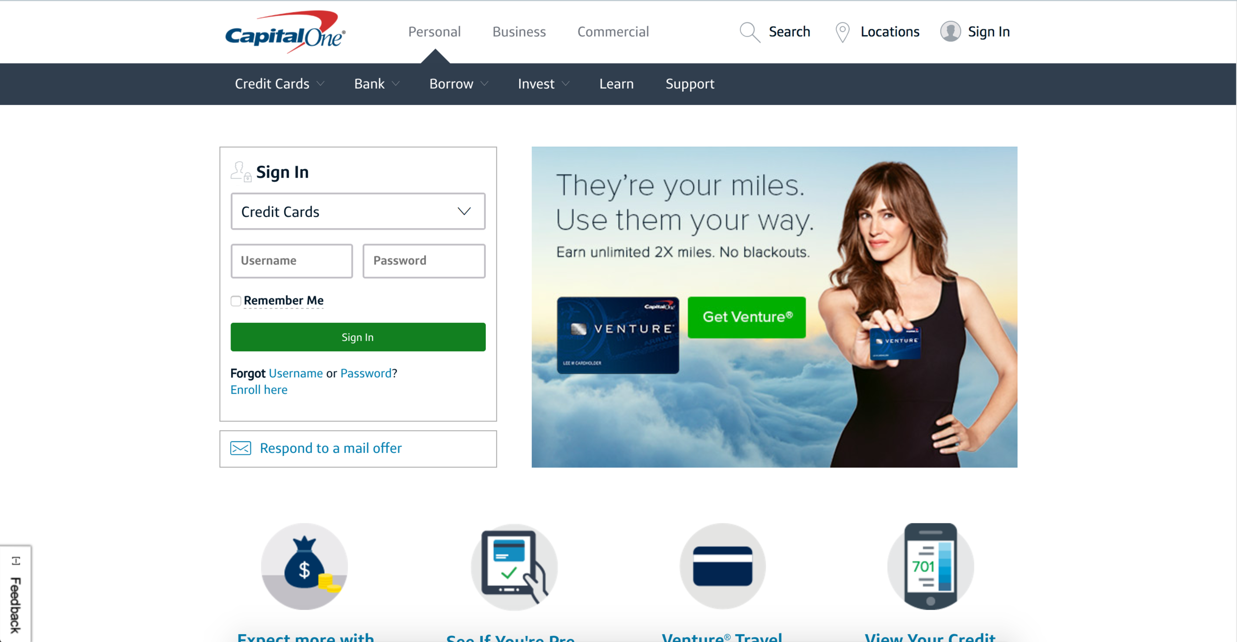
The biggest challenge of this project, was to introduce the idea of UX design to the team, and convince the business that great UX brought something of value to the table. The design that was currently in market was bulky, slow, looked dated, and packed with information that was hard to find.
I tasked myself to completely rethink how customers learn about Capital One credit cards. This meant I could influence visual, content, tech, and even policies around how we can talk about credit cards with our customers.
Once a customer finds a card, they wanted to learn more, get the key details, and make a decision (if they were ready to do so at that point in their card search). However, with so many cards to choose from, we uncovered a business + human need that would enable our customers to find the right card for them.
The approach
Change the game.
I saw an opportunity to not just redesign product pages, but to redesign how Capital One talked about, presented, and informed users of their products.
With a content strategist, and 2 front end developers, webegan competitive analysis, visual inspiration gathering, and A/B testing visual styles.
We brainstormed a design system that was visually informative, in-line with brand standards, and provided transparent card information, and took it to testing.
30+ hours of testing and 2 sprint cycles later, we had a design that was working well and validated by real customers.
The action
Simplicity wins.
With our iterated, tested, and validated design system, we applied the design to a prioritized series of customer facing pages and launched.
Two months later we had iterated and tweaked the design multiple times and started to see strong customer reaction. We continued through a few more sprint cycles to tweak the interactions across the site, and began socializing the successful launch internally.
The internal response was incredible. For the first time, we began seeing a largely positive reaction to a design team in a company that had previously only been interested in conversion rates and metrics. It was clear to the internal teams now that UX design paired with a strong brand identity could drive change not only for our customers, but change in the way the company viewed and approached digital problems.
The result
Findable, and understandable.
We saw an immediate increase in application activity, a reduction in phone calls related to card searches, and an internal push to redesign the website beyond the card product pages. This internal push to redesign the rest of the site ended up being a more impactful result than all of the positive reviews and metrics of the actual redesign performance.
The design work for this project helped pave the way for an increased role of design across the company, and set the standard for what future designs could look like. It ended up influencing the current visual styles across all digital products, and put the word out that design could be a powerful tool in the ever changing world of digital spaces.