Electronic Arts: skate.

my role
As Senior UX Designer on Electronic Arts’ skate. team, I joined the project at its earliest stage, before the game had defined structure or playable systems, and helped shape the foundational player experience from the ground up.
I contributed across core pillars of the game, including metagame design, progression frameworks, UX systems, and scalable UI interaction patterns. My primary ownership focused on onboarding and the first hour of gameplay, designing the critical early experience that teaches players how to move, explore, and engage with the world.
I also conceived and led the development of Isle of Grom, the game’s tutorial island. From initial concept through release and iteration, I drove the design of the island’s structure, flows, and UX patterns that introduce players to the core mechanics and tone of skate..
My work helped establish scalable UX foundations that continue to support the game’s evolving live-service ecosystem.
The Challenge
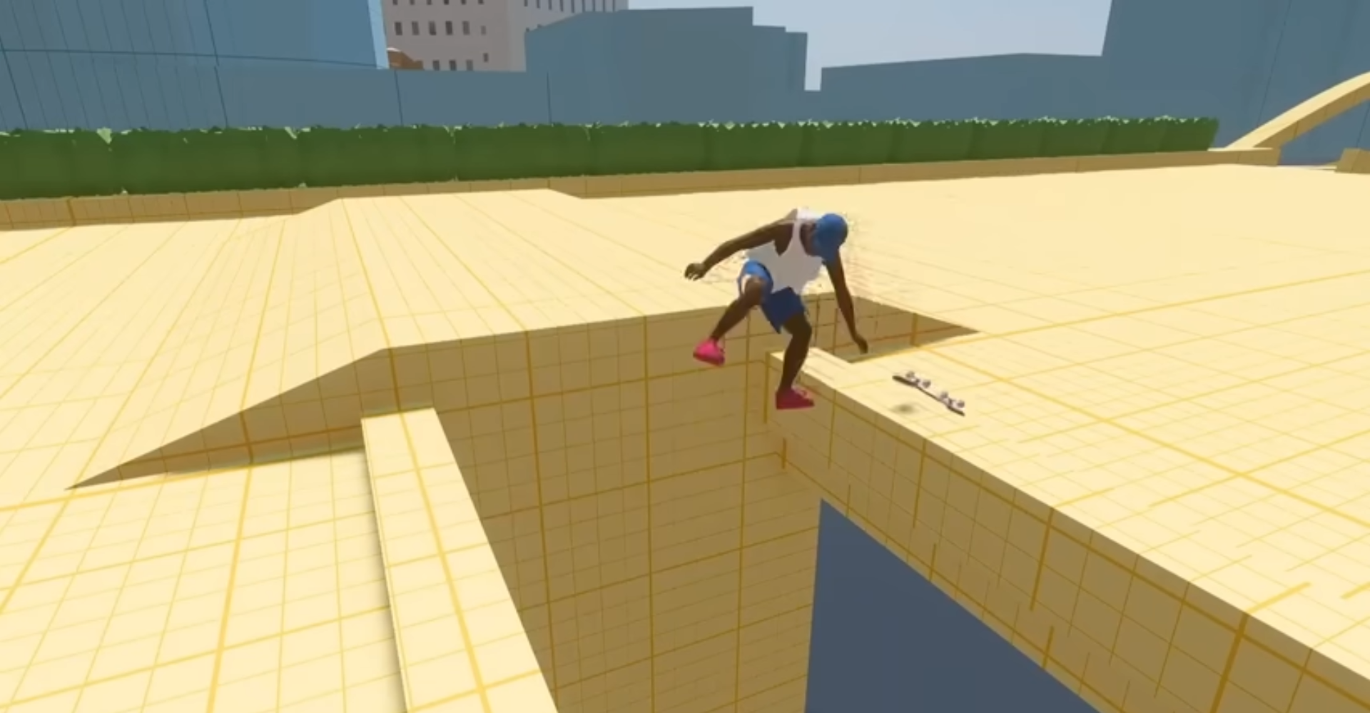
Designing for momentum, freedom, and readability.
skate. is a sandbox built on freedom and expression, but its mechanics are difficult to learn and even harder to master. One of the team’s biggest challenges was helping players understand what the game had to offer by giving them the skills needed to unlock the fun.
Playtesting revealed the problem clearly: information was scattered, systems felt disjointed, and new players struggled to meaningfully engage with the world, the skating mechanics, and the broader metagame.
At the same time, as a newly forming team, we needed more consistent UX patterns and a clearer design language to support onboarding across the game’s many features.
This created a two-part challenge:
• Help players quickly understand how to play and progress
• Establish scalable onboarding patterns for the broader game

The approach
Unify the experience. Teach the game. Maintain player flow.
Working with a cross-disciplinary team across design, product, engineering, and narrative, I focused on aligning the early player journey and the UX systems that support it.
To understand where players struggled and where the experience broke down, we combined playtesting insights, telemetry analysis, and genre research. These insights informed experience maps that clarified the first-hour player journey and revealed opportunities to simplify and unify how information, challenges, and progression were introduced.
From there, I helped establish foundational UX patterns and design system elements that could support onboarding not just for the tutorial experience, but for the broader game as it expanded through live service.
Through rapid prototyping, testing, and iteration, we refined how players learn the mechanics, discover the world, and engage with the game’s systems.
The result went beyond visual polish. It reshaped how information is delivered, how players learn the game, and how new features take form. It also created a shared design language across teams, enabling more consistent, scalable experiences as skate. continues to evolve.

The Action
Design clarity without killing the vibe.
I refined UX across several core systems to improve comprehension, speed, and early-game onboarding. The goal was to help players quickly understand how to move through the world, engage with content, and progress through the game’s broader systems, all while preserving the open, expressive feel that defines skate.
A major focus of this work was designing the first-hour player experience. I conceived and led the development of Isle of Grom, the game’s introductory island, creating a guided but flexible space where players learn core mechanics, explore the world, and discover the rhythm of play.
Working closely with gameplay, world design, and engineering, we shaped the island into a cohesive onboarding experience that introduces movement, progression, challenges, and exploration in a way that feels natural rather than instructional.
Key contributions
Simplified UX flows across progression and challenges
Designed frameworks used across multiple systems
Established clear, teachable progression structures
Created narrative and instructional patterns that reinforce learning through context and play
Clarified the metagame hierarchy and system relationships
Designed fast, legible travel and location selection flows
The Result: Isle of Grom
Clearer. Faster. Scalable. Played.
When these UX patterns were applied to the Isle of Grom, the tutorial island I concepted, drove, and helped launch, the impact was immediate and unmistakable:
Players grasped the game’s purpose and potential faster, supported by clearer guidance, intuitive navigation, and a more coherent learning arc.
Onboarding became meaningfully smoother, reducing friction and getting players into the fun sooner.
Reusable UX patterns emerged, enabling the team to ship updates, new features, and seasonal content with less rework and far greater consistency.
The island gained a distinct, recognizable identity, strengthened by a unified visual and interaction language that fit naturally within the broader world of skate..
Clarity improved without restricting freedom, preserving the open-expression, find-your-line ethos players expect.
Isle of Grom ultimately became the foundation for how new players enter the game, learn its systems, and build confidence—while giving the studio a scalable UX model that continues to support the live-service roadmap.